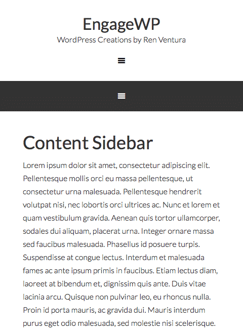
Say your website is using two menus: a header-right menu and a primary menu underneath the header. Everything looks great but when your website is viewed on smaller screens, both menus shrink down into their own, separate mobile-menu, resulting in two different “hamburger” icons, like so:

From a user’s perspective this can be confusing and, as a site owner, it’s reasonable to think this just flat-out looks bad. Most of the time, there’s no need to have two separate mobile menus like this. However, if you think about it, the reason this happens makes sense. It happens because you are using two separate menus. Pretty obvious, right?
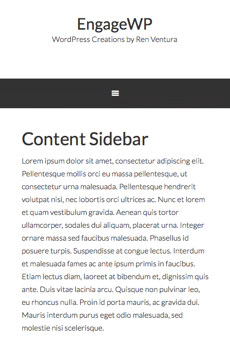
The trick I’m about to show you technically is not combining menus but rather displaying a new menu when needed. In this example, we have our two menus but we only want to display one when the user’s screen is small, such as while viewing on a smartphone. To get around this, let’s register a new menu location, hook it somewhere (this part is Genesis-specific), hide it until the viewport is below a certain width, hide the other menu locations once that minimum width is passed and display the new menu. Nothing too complicated…just a simple solution.
PHP
This bit of PHP can go in your functions.php file. It simply creates and outputs the menu. If using Genesis, you can change the hook to output the menu wherever you want. If not, place the code within the function in the appropriate theme file (probably your header.php).
CSS
First, the CSS hides the “Mobile Menu” at screen-widths above 960px (the point at which the child theme I was using breaks the menu down into the mobile menu). You’ll need to change the 960px if your child theme uses another point to “turn on” the mobile navigation, such as 800px. Then, once the width hits 960px or less, the mobile menu styling kicks in so I will hide the other two menus and display the Mobile Menu I created with the PHP. Since I assigned the nav-primary class to Mobile Menu, it will inherit the same styling as the Primary menu, which is what I want because it keeps the look consistent.
Assign a Menu to Mobile Menu
Lastly, create a new menu and assign it to the Mobile Menu location. Since this is an entirely new menu, you can add whatever items you want. Whether you re-add the links that are in the other two , show a condensed menu, etc., you can do with this what you want.

Summary
There you go! You’ve now “merged” two menus into one in the sense that you added a new menu to display when your site is viewed on smaller screens. I admit this is kind of a hack because all three menus will still be in the DOM (page output) but it gets the job done. There is probably a cleaner solution but this is the most straightforward and easiest to implement.
I have 2 hamburgers, one after the other, using your coding. Both hamburgers share the same selectors so I haven’t been able to fix the problem myself.
Within WP setting’s Menus “Manage Locations” page, I’ve tried:
(1) Assigning the Header Menu & Mobile Menu to the same location, I get double Hamburger icons in my header.
(2) Assigning only Mobile Menu (in the header area) & not assign the Header Menu, I get only 1 Hamburger icon; however, my desktop Header Menu disappears.
(3) Assigning I assign only the Header Menu (in the header area) & not assign the Mobile Menu, my website breaks.
Maybe the easiest thing would be to do #2 above and somehow add the “primary” menu back to the header above a certain break point?
Awesome except that I have a double hamburger effect.
Any ideas how I could fix that?
Thank you in advance.
Hello,
Nice technique, I tried it here :
xxxtestdocumentmanager.themecloud.website
I had to add these css to avoid double hamburger :
ul#menu-tout-en-haut {
display: none;
}
ul#menu-top-menu {
display: none;
}
ul#menu-navigation-principale {
display: none;
}
button#mobile-genesis-nav-primary {
display: none;
}
Works well but still I don’t know how avoid having automatically added the links of my menu from right header widget above my mobile menu starting really at “Accueil” and ends at “3 Étoiles”
Regards
Marc
Any idea why the mobile toggle button wouldn’t attach to the new menu? I tried it and it seems to not show the button for the new menu.
Genesis 2.5.2
Thanks
I like your comment redirect page, too. What system are you using for that?
Thanks.
Hi, Carolyn. I’m glad you liked the post!
The follow prompt I have working after comments are posted is something I created myself. I just recently released it as a plugin on the WordPress repo, and you can read more about it here:
http://www.engagewp.com/display-calls-action-new-blog-comments/
This is great! Just what I needed for a particular mobile site, and worked like a charm. Thanks, Ren!